Property Finder: Rebuilding search, app to web
Search was the product. It just wasn't acting like it.
- Client
- Property Finder
- Role
- Product StrategyProduct DesignExperimentation
- Sector
- Real Estate & PropTech
- Engagement
- Embedded product leadership
- Delivered
- Delivered by Rai's founders, while at Property Finder · 2025–2026
How might we make the results page better at helping people decide, without touching the ranked order advertisers pay for?
The problem.
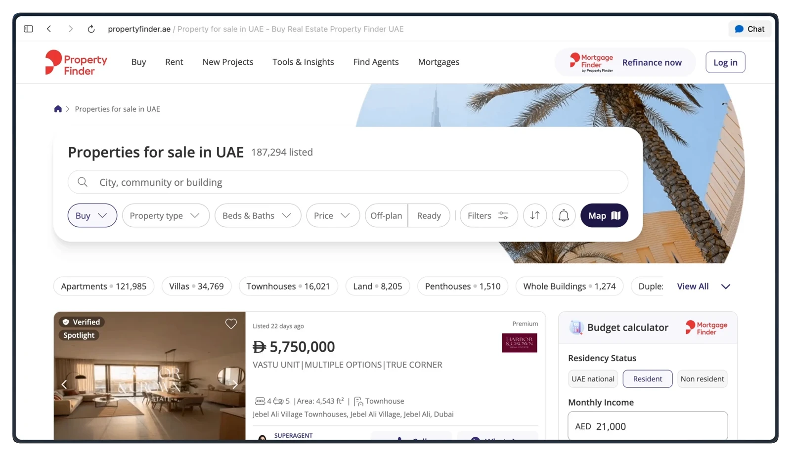
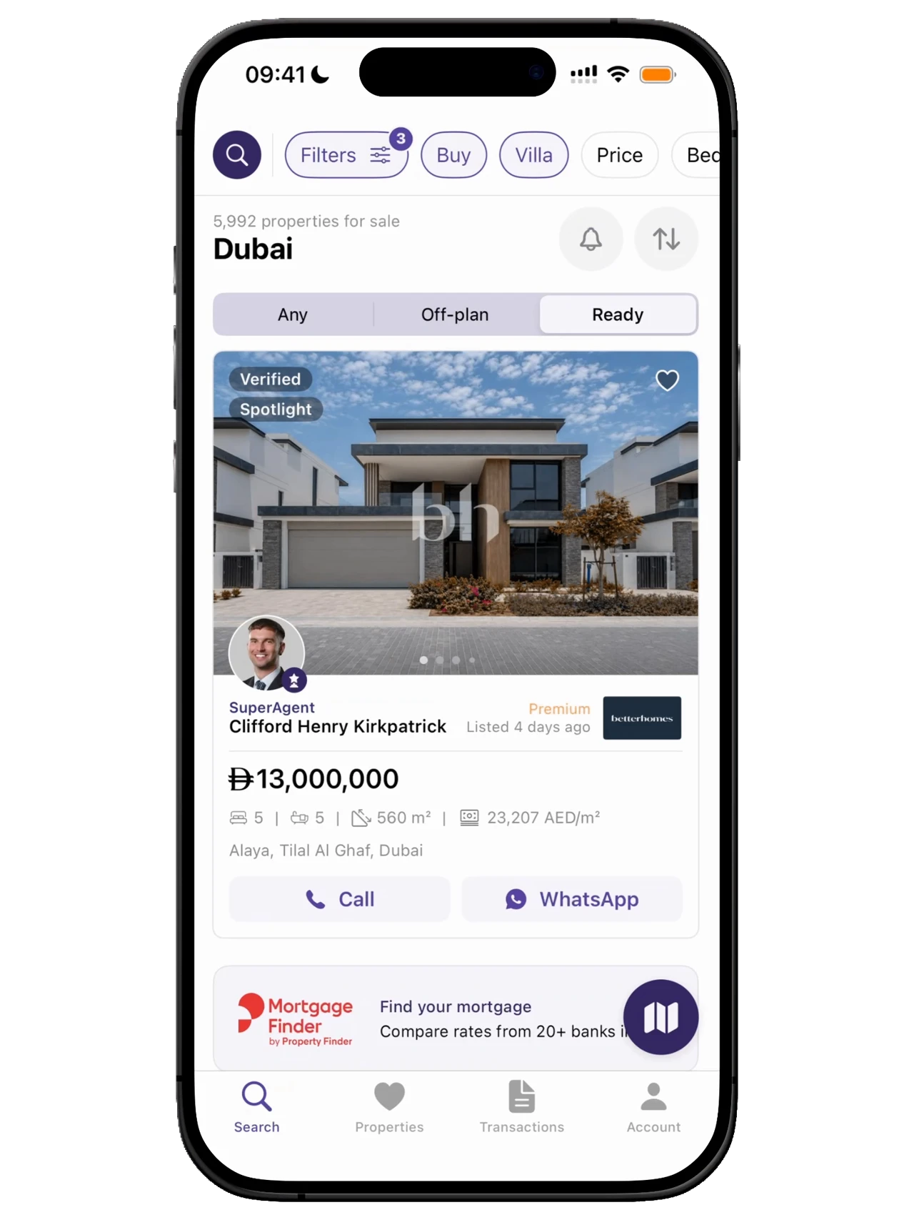
Every session runs through search results, and the surface had grown cluttered. The hierarchy was weak, too many signals competed for attention, and the details people needed to compare sat below the fold where most never scrolled. People couldn't scan, couldn't compare, couldn't quite trust what they were looking at.
The space being sold to advertisers is the same space a buyer needs in order to decide. Years of adding placements and signals had crowded out the information that actually drives a decision.
How might we rebuild the results page around deciding, without reordering the ranked list advertisers pay for?
What we learned.
The page was costing both sides of the marketplace.
So whatThe friction wasn't just costing leads. A results page that converts poorly is worth less to the agents paying to be on it, which made the fix a commercial case, not just a design one.
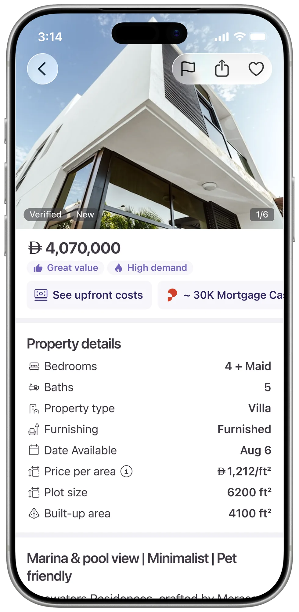
Price and title are what people scan for first.
So whatThe hierarchy had to lead with them, put trust and quality cues on the card itself, and cut everything that wasn't helping someone decide.
One pattern had to carry every listing type.
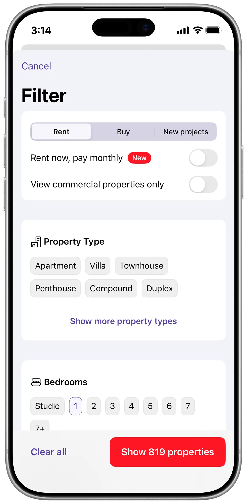
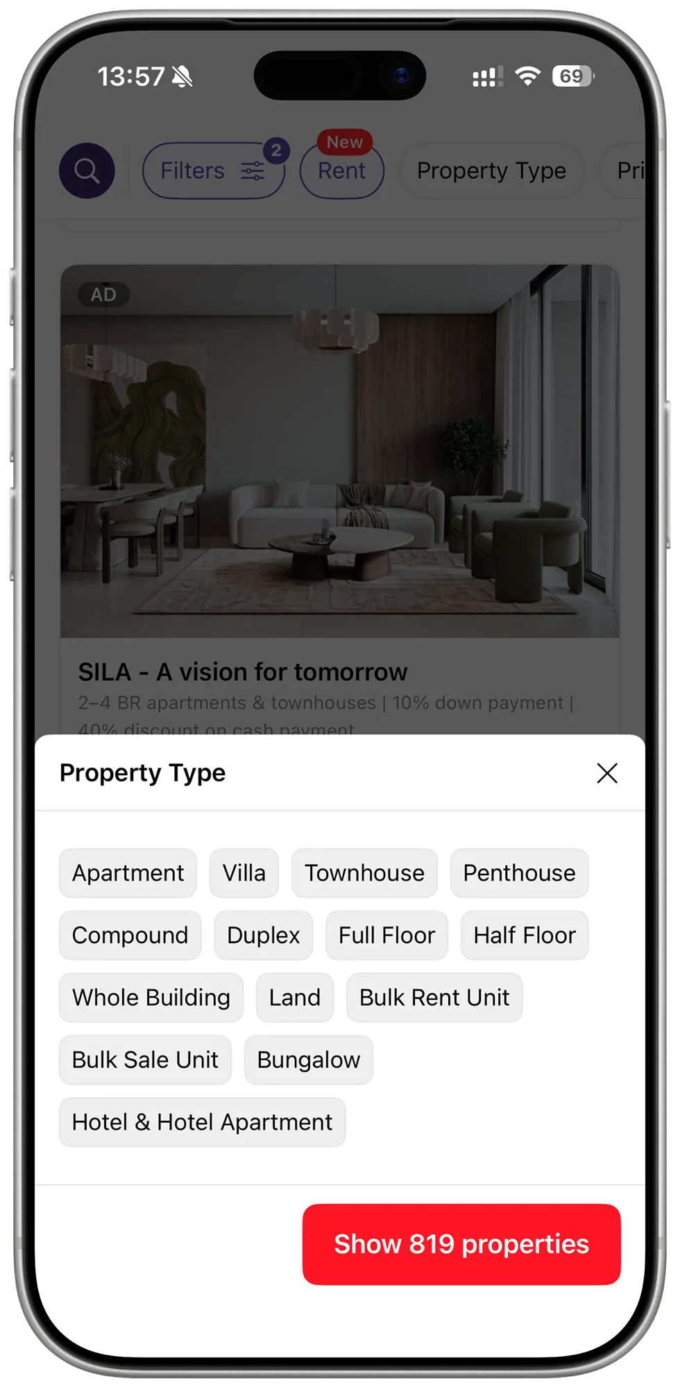
So whatConsistent interaction logic across listing types means the page scales instead of fragmenting, and a new type slots into the existing pattern instead of arriving with its own.
The call.
Leave the monetisation layer alone
Work around the placements and improve what sits between them. The safe move, and it would have left the actual problem in place.
Cut the low-performing placements
Give the space to what helps people decide, and make the case commercially: we could show the conversion uplift was worth more than the placements it cost.
The maths made the argument. A page built for decisions converts better, and the uplift was worth more than the space we removed.
What shipped.
The impact.
The redesign was A/B validated on app and again on web, two platforms where people search differently.
- +1.8pp conversion rate lift, A/B validated on app and web
- ~500k additional leads a year
- 2 platforms, proven on both: app first, then web
The space being sold and the space for deciding were the same space. The work was making one page do both.
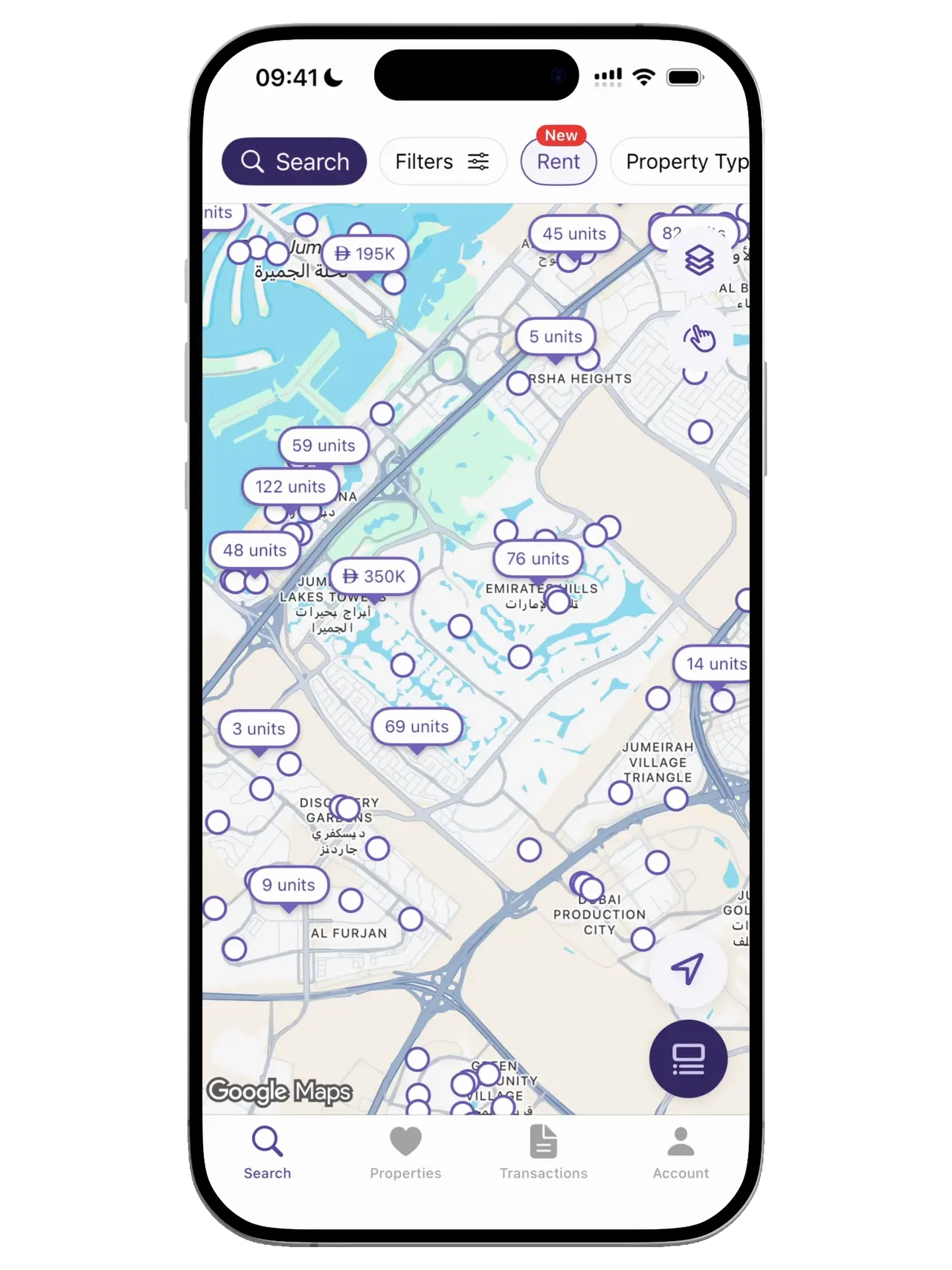
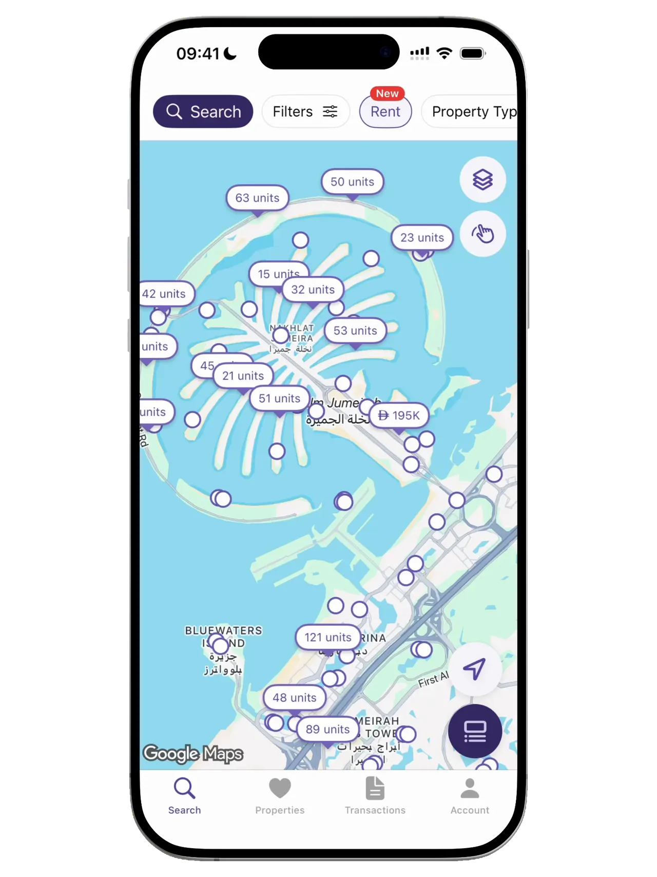
Property Finder: Making the map the search engine
Rethought how buyers browse listings on the map. Map-session leads rose from 5% to 32%.