Property Finder: Making the map the search engine
Users were opening Google Maps mid-session. That was the whole brief, really.
- Client
- Property Finder
- Role
- Product StrategyProduct DesignInteraction Design
- Sector
- Real Estate & PropTech
- Engagement
- Embedded design leadership8 weeks
- Delivered
- Delivered by Rai's founders, while at Property Finder · 2026
How might we make the map the primary way to discover and evaluate a home without ever leaving Property Finder?
The problem.
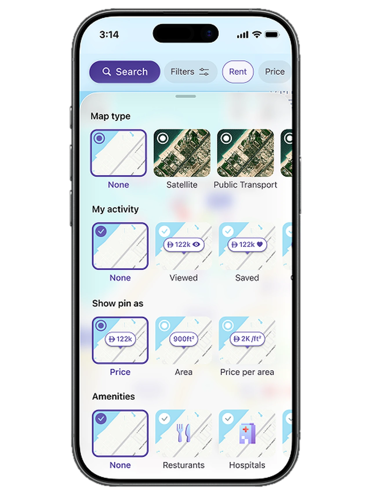
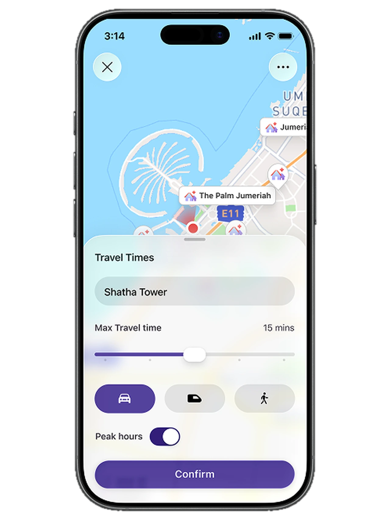
Property search in the UAE is spatial: the commute, the school pick-up, and what's actually on that street. But the app kept burying the map. People opened Google Maps mid-session to check the neighbourhood, lost their place, and often didn't come back.
The map was a passive layer sitting on top of the results. It reflected the search without ever driving it, so the spatial understanding people needed in order to decide lived in a different app.
How might we make the map lead discovery and evaluation without ever reordering the ranked list advertisers pay for?
What we learned.
Location confidence drives leads, more than listing quality.
So whatPeople who could orient themselves spatially, understanding commutes, amenities and neighbourhood character, were far more likely to submit a lead. The listing itself was almost secondary.
Dense vertical inventory breaks standard map patterns.
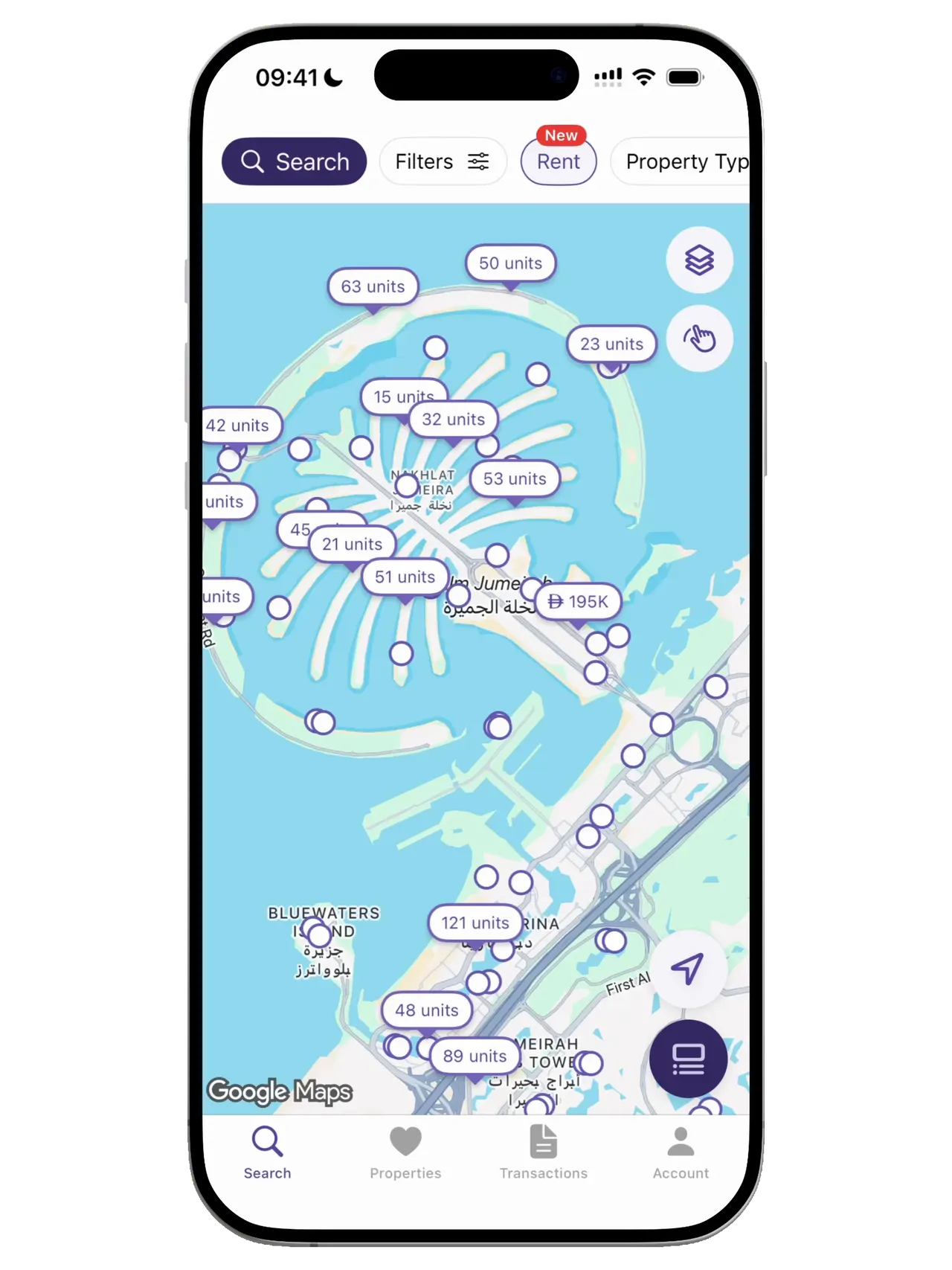
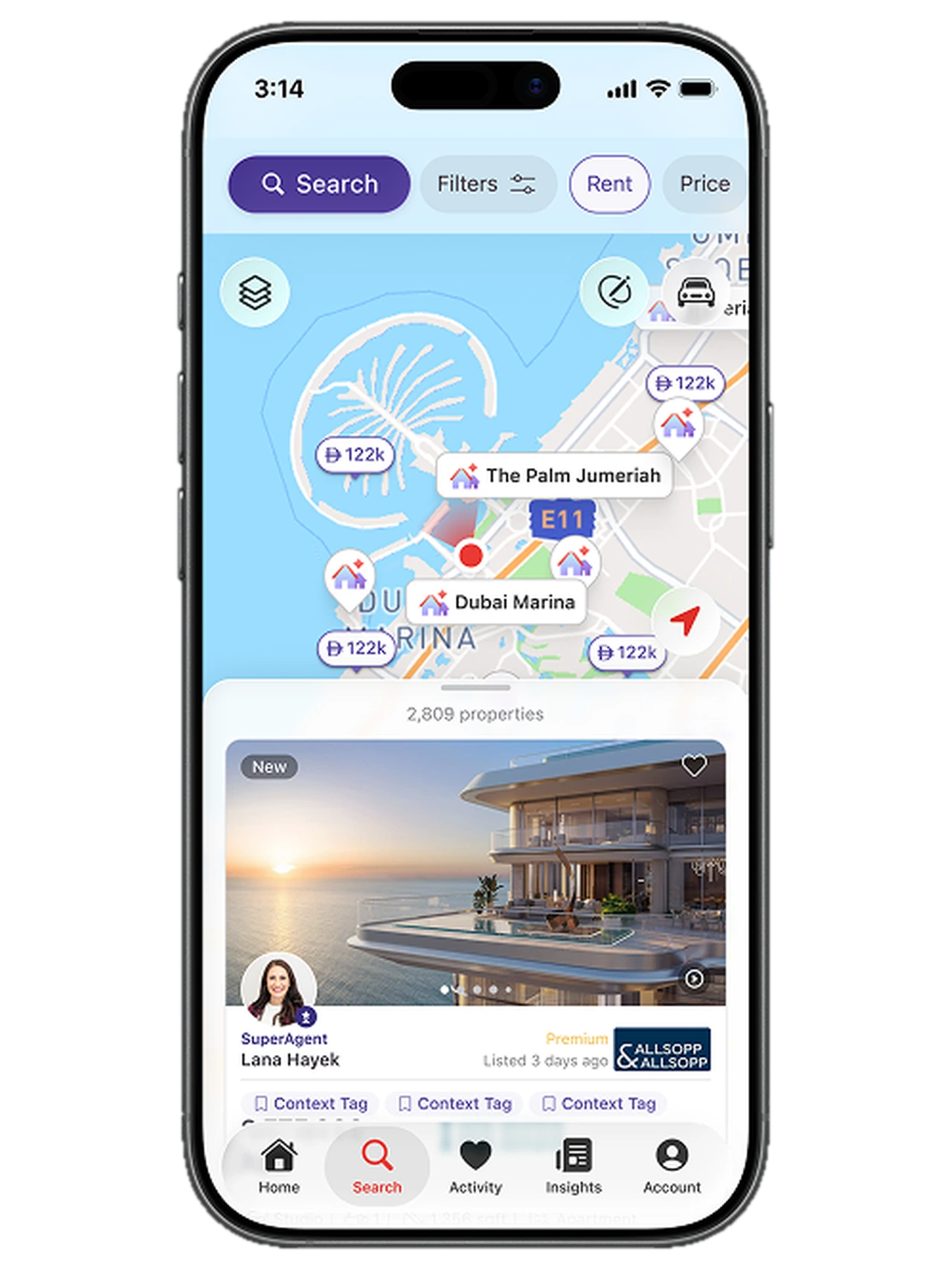
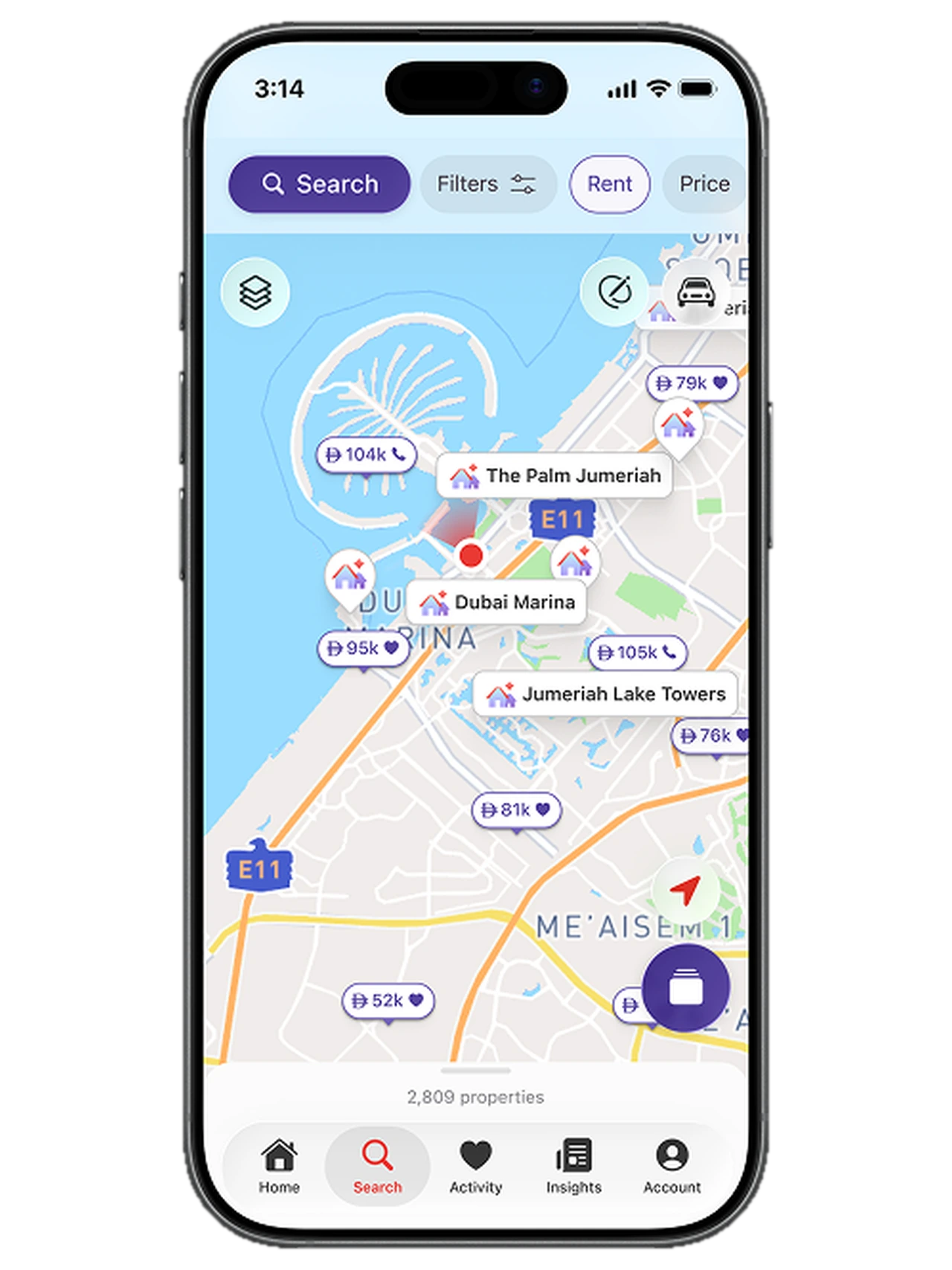
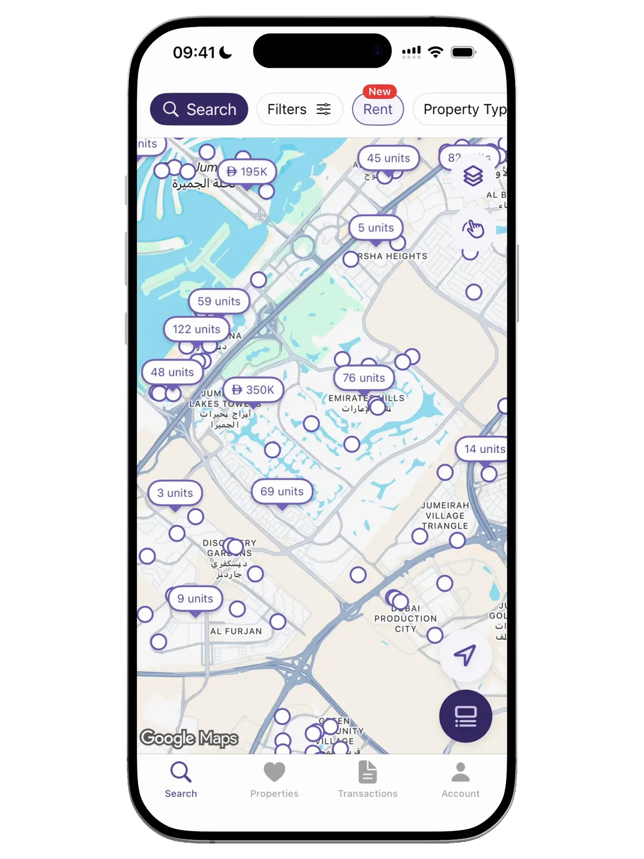
So whatHotspots like Marina and Downtown hold dozens of units at one building coordinate. The map needed its own entity model: single pins, building stacks and zoom-based clusters, each with strict, non-overlapping behaviour.
People don't want a map mode, they want map-first search.
So whatA toggle frames the map as optional. Binding the results list to the viewport, so panning updates results in real time, makes the map the authority rather than an add-on.
The call.
A bigger map on the results page
Keep the list as primary and add a richer map panel beside it. The risk was lower and instantly familiar, but the map still sits under the results, and that was the problem.
Map-first, results as companion
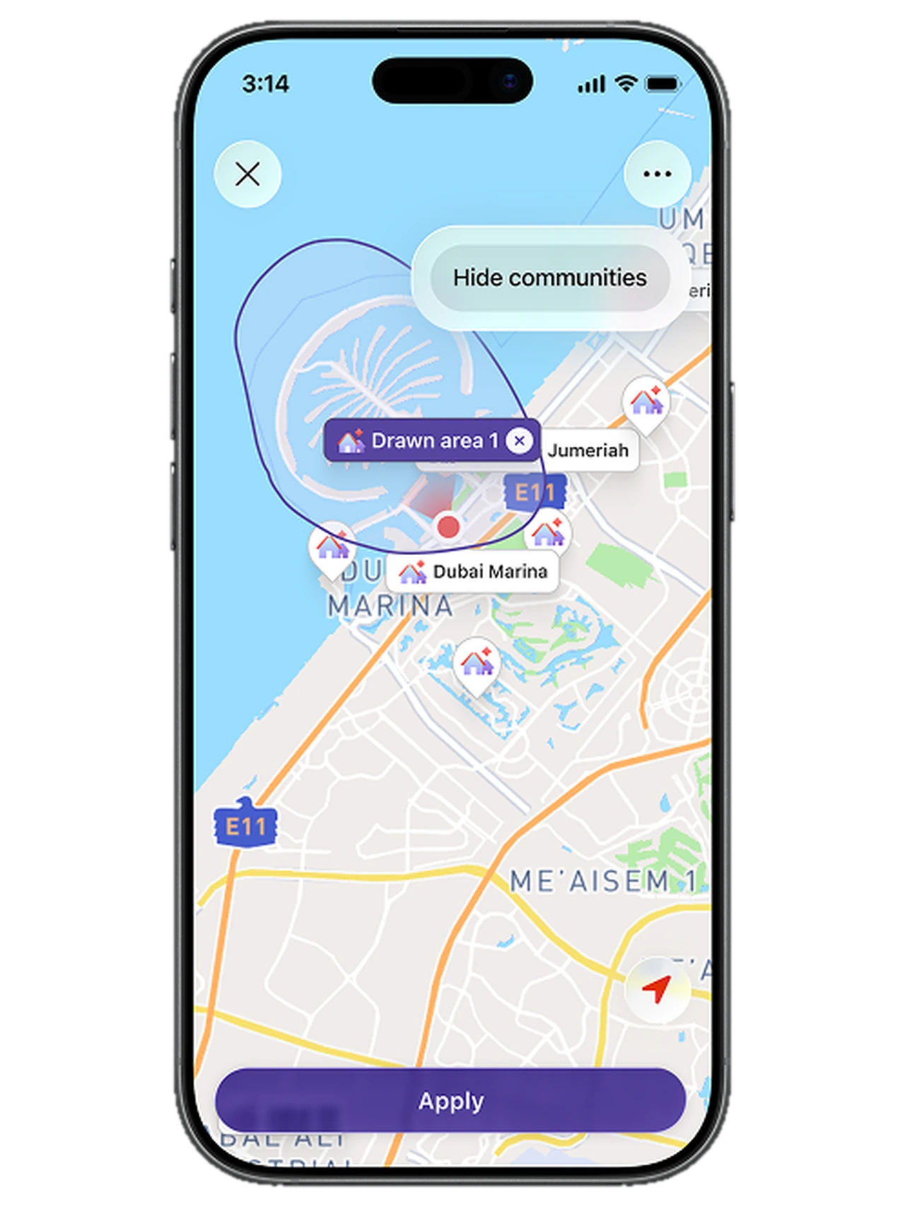
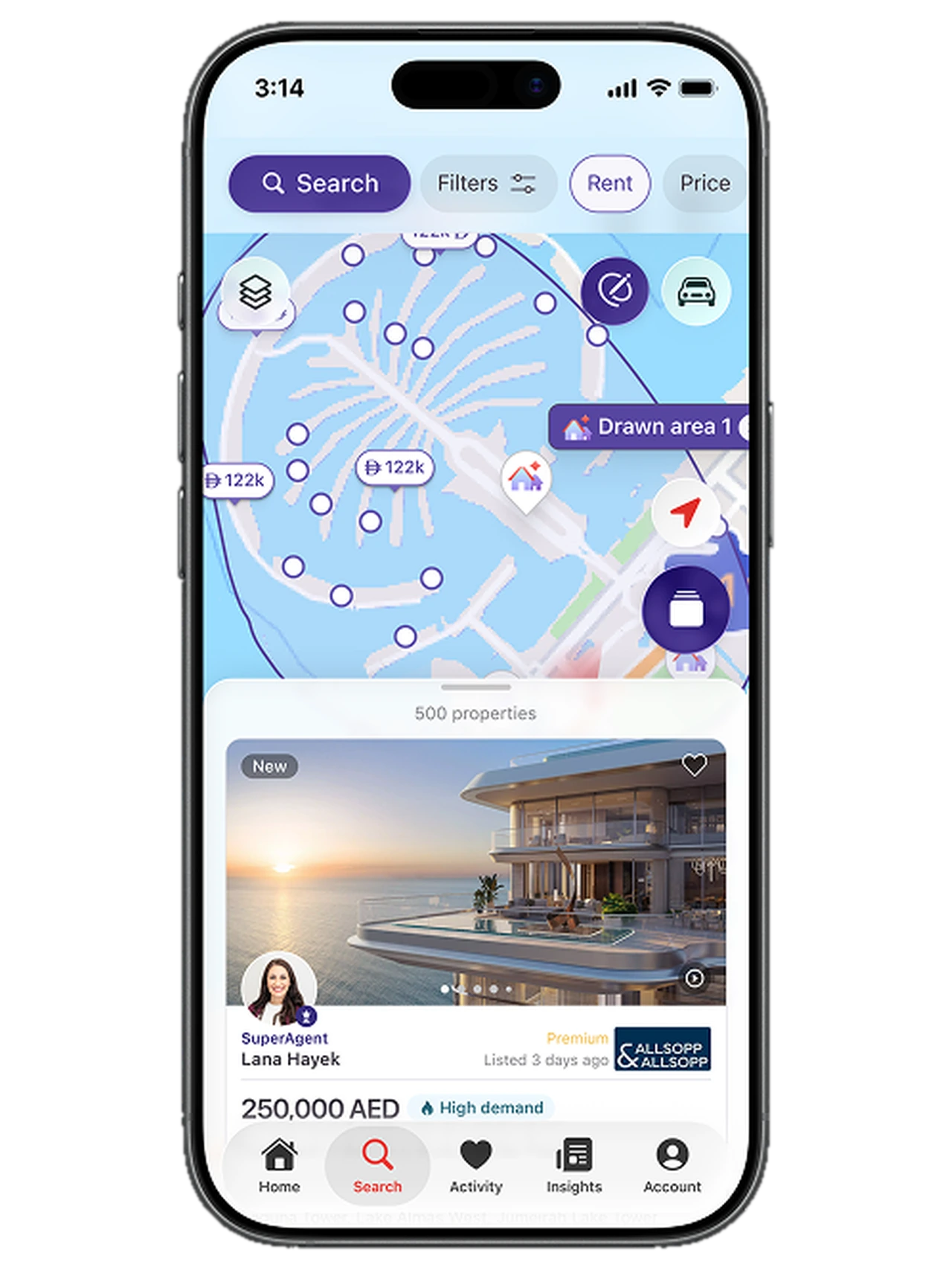
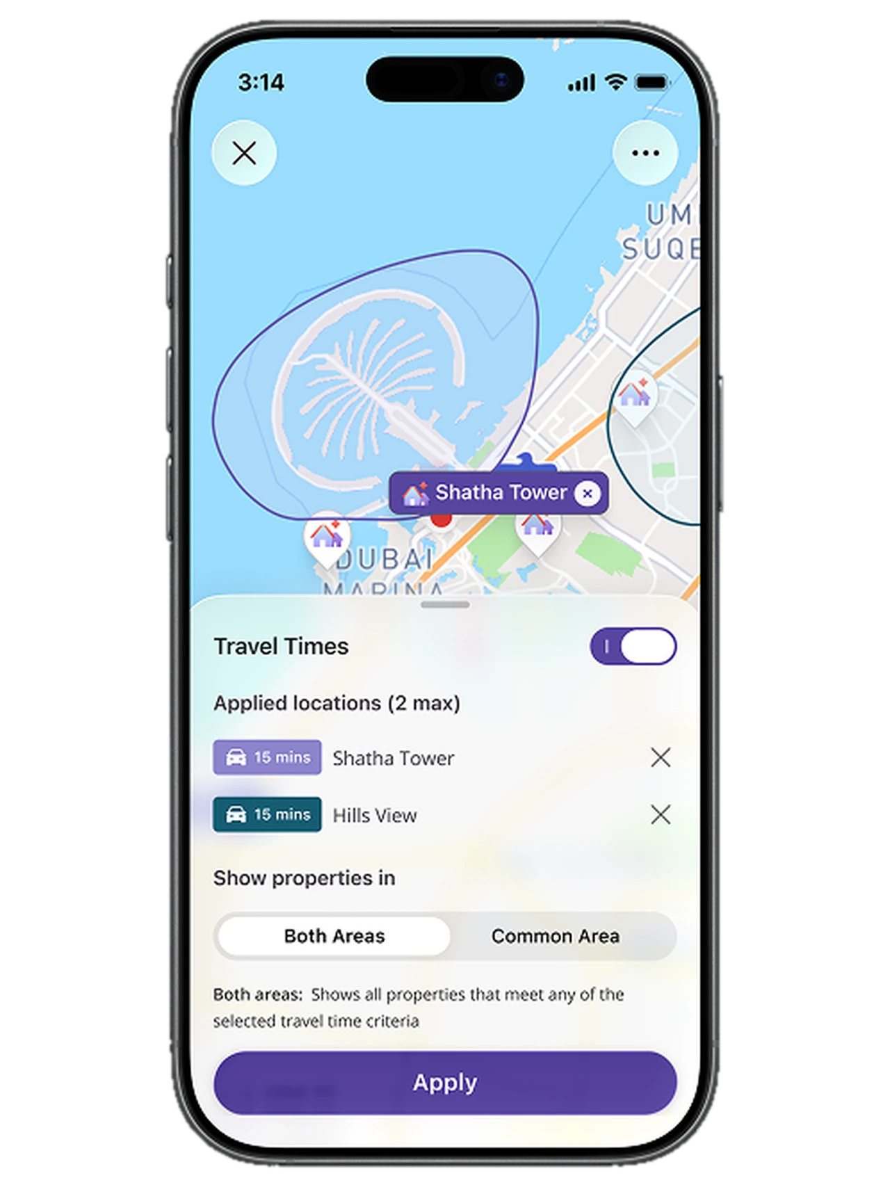
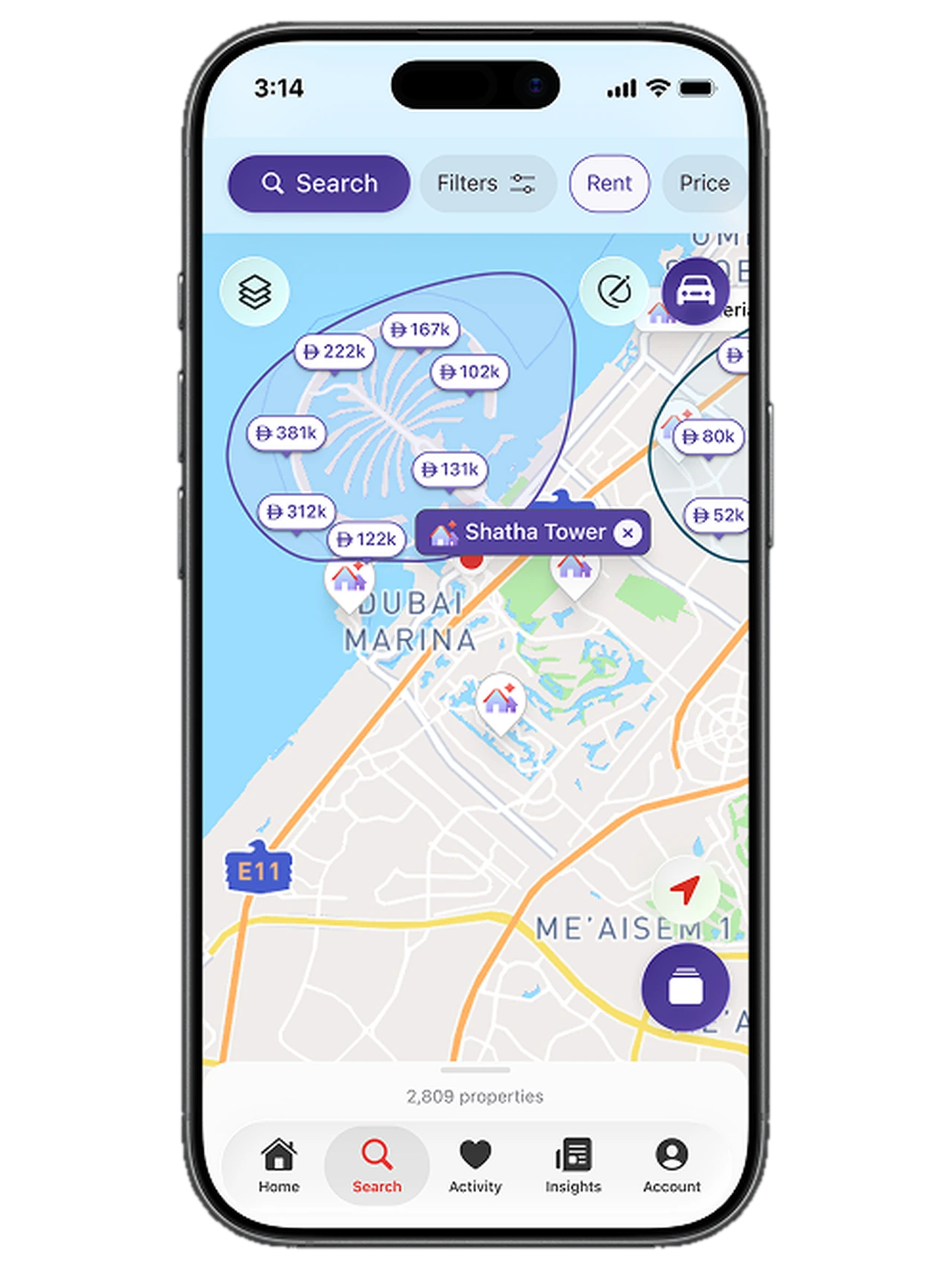
The viewport is the query. Pan or zoom and the list updates in place, while the ranked order stays untouched.
The research showed people were already searching map-first in their heads, just across two apps. This built the app around that behaviour, and kept the commercial model intact: featured listings still lead the companion list.
What shipped.
The impact.
The map went from the thing people left the app to replace, to the reason they stayed.
- 5% → 32% of leads now come from map sessions (pilot markets)
- 74% of users adopted the new map-first experience
- 8 wks embedded, from discovery to shipped
The hardest constraint wasn't technical, it was commercial. Advertisers pay for ranked placement, so the map had to lead the search without ever reordering the list.
ADCB: One design language
Three banking products brought under one design language, without tearing down what customers already trusted.